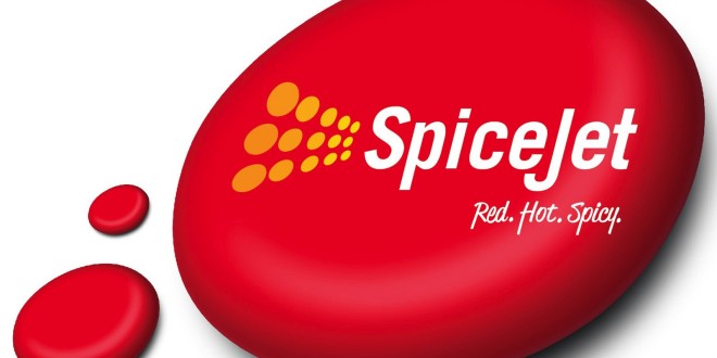
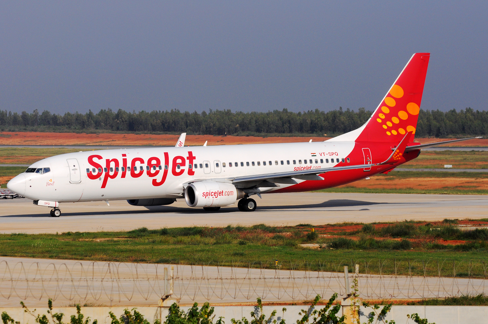
Low fare carrier SpiceJet commenced its second decade by unveiling a sexy new look branded “red, hot, spicy”.

A new 3-D logo inspired by the mobile app world will replace the traditional 2-D one.
The new 3-D logo, slogan, and posters and advertising comes at a time when Ajay Singh has taken over the airline. The new slogan puts the airline’s core DNA out front and will spearhead SpiceJet’s efforts to make flying “unboring.”
And we suggest you pay close attention to the models on the posters. You might just bump in to them on your next SpiceJet flight since they are all SpiceJet crew.


Share your thoughts via a comment.
 Bangalore Aviation News, Reviews, Analysis and opinions of Indian Aviation


This article is sexist and unnecessary. I expected better from you, Devesh.
If you are referring to the last line you are correct. Have removed the line. It was indeed unnecessary. Thanks. As far as the branding goes, like it or not, unfortunately, sex sells, not just in India, but globally.
I did mean the last line. Thank you for that and the apologies said. This isn’t the first time SG has done an advertising campaign in this fashion, but you were always respectful covering such tactics in the past, so it seemed particularly out of place this time. Thank you for addressing.
It would have been so much better to use the company aircraft rather than a 767 image for the poster.
Well if re-branding is the crux of this article then you’re spot on. Can’t concur with the sexist remarks and what the hell was with the two-inch reference??!! Broaden your views man!! You brag this blog to be read by many and yet you want to help stereotype Indian men again?!
You are correct. I must have been in a stupid frame of mind. Have removed the line. Thanks for setting me straight.
Rather than spending money on models, they should replace their bombardier aircraft by better aircraft. Also, OTP is important, whose experience is very bad in my case when I flew by SpiceJet. Ofcourse, haven’t traveled in this airline post exit of Marans.
BTW, this RED thing reminded me of KFA :p