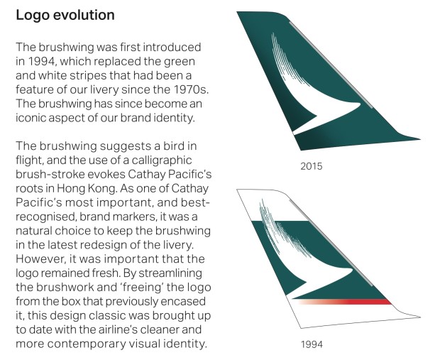
Cathay Pacific unvieled it’s new livery yesterday at a special event held at Hong Kong International Airport. The livery has been launched on B-KPM, one of the airline’s Boeing 777-300ER’s.
The new livery will replace the current livery which was unveiled in 1994. The airline’s Airbus A350 fleet will be the first aircraft type to be in only in the new livery and existing aircraft in the fleet will be painted in the new livery over the next five years.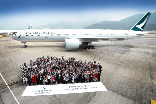
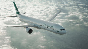
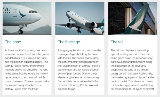
The new livery builds on the conservative nature of the older livery and incorporates many subtle but key changes. The most apparent change is the missing colour red, the airline has simplified it’s colour palette to to Cathay Pacific green, grey and white. The airline’s brushwing logo has been given more visibility and is featured behind the nose and on the tail of the aircraft. The fuselage has a single grey band and the airline name in a more prominent size.
 Ivan Chu, Chief Executive, Cathay Pacific
“Today represents the beginning of a new era for Cathay Pacific. We are very happy and proud to unveil our new aircraft livery which represents our journey into the future and also celebrates the many great things we have achieved over the past seven decades as the home carrier of Hong Kong.
The livery is a vital part of our brand image – a symbol of the company’s values displayed on our most important physical asset. The livery represents Cathay Pacific in and out of Hong Kong and every time our aircraft take off or touch down in our network of destinations around the world.
Creating a new livery is much more than a cosmetic exercise. This new look is the latest – and most significant – development in our ongoing efforts to improve the overall customer experience at Cathay Pacific. It is also a highly visible representation of the huge investments we are making in new aircraft and products as part of our ongoing commitment to build Hong Kong’s position as an international aviation hub.”
In recent years, the airline has made investments in new aircraft and new products to build Hong Kong’s position as one of the world’s best aviation hubs. Cathay Pacific describes the livery as a symbol of its commitment to its home city as well as a visible representation of its promise to offer a Life Well Travelled to customers.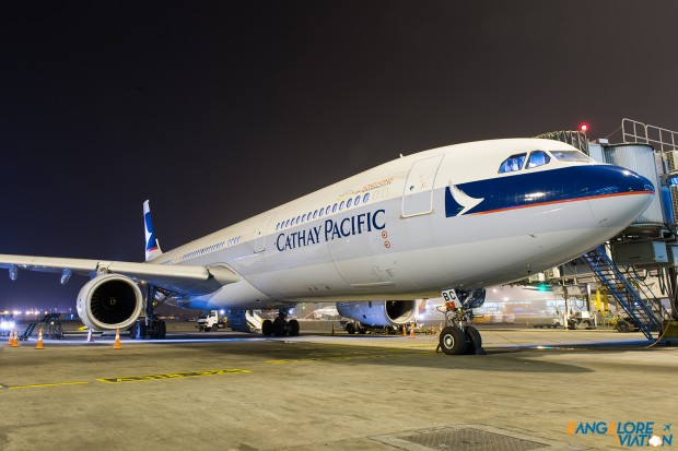
 Bangalore Aviation News, Reviews, Analysis and opinions of Indian Aviation




That’s a new livery?
Does not seem to be a big change. Some smart “brand managers” seem to have ripped Cathay very well!
Still a beautiful livery…Simplified and elegant.